Inspiration in Imperfection: Reclaimed Wood and JB Blunk's Handcrafted Legacy

 
JB Blunk’s home on the Inverness Ridge with Redwood Enry Arch, 1976. Photo credit: ©LeslieWilliamson

JB Blunk’s home on the Inverness Ridge with Redwood Enry Arch, 1976. Photo credit: ©LeslieWilliamson


J.B. Blunk’s art career was probably inevitable one form or another, but it was a chance encounter with Isamu Noguchi in a Tokyo craft shop that put him on course to become one of the most innovative American craftsmen of the 20th century. It was the early 1950s, and Blunk—then a soldier in the US Army, stationed in Korea—was browsing at the craft shop when he met Noguchi who was there with his wife. Yamaguchi Yoshiko. Prior to his tour in Korea, Blunk had been a student at UCLA where he became fascinated by ceramics, and Noguchi decided to introduce him to the Japanese artistic polymath Kitaoji Rosanjin, who made exquisite, rustic and colorful pottery inspired by historical Japanese ceramics, as well as lacquerware and calligraphy. Blunk apprenticed himself to Rosanjin, became a skilled potter in his own right, and later worked for artist Toyo Kaneshige, a Living National Treasure. Returning to California in 1954, he was now energized and inspired to embark on a life in which craft shaped every corner of his life. Blunk’s name isn’t synonymous with midcentury style, and he’s not a household name. (Yet.) But with exhibitions in major galleries, including Kasmin and Blum & Poe, introducing his work to new audiences, his legacy seems to be getting the second look it deserves.

 
J.B. Blunk in his studio, c.1968. Courtesy: J.B. Blunk Collection

J.B. Blunk in his studio, c.1968. Courtesy: J.B. Blunk Collection

Interior of JB Blunk’s home with river stones and artworks by Blunk. Untitled painting, c.1990, and Redwood stool, c.1965.  Photo credit: ©LeslieWilliamson

Interior of JB Blunk’s home with river stones and artworks by Blunk. Untitled painting, c.1990, and Redwood stool, c.1965.
Photo credit: ©LeslieWilliamson


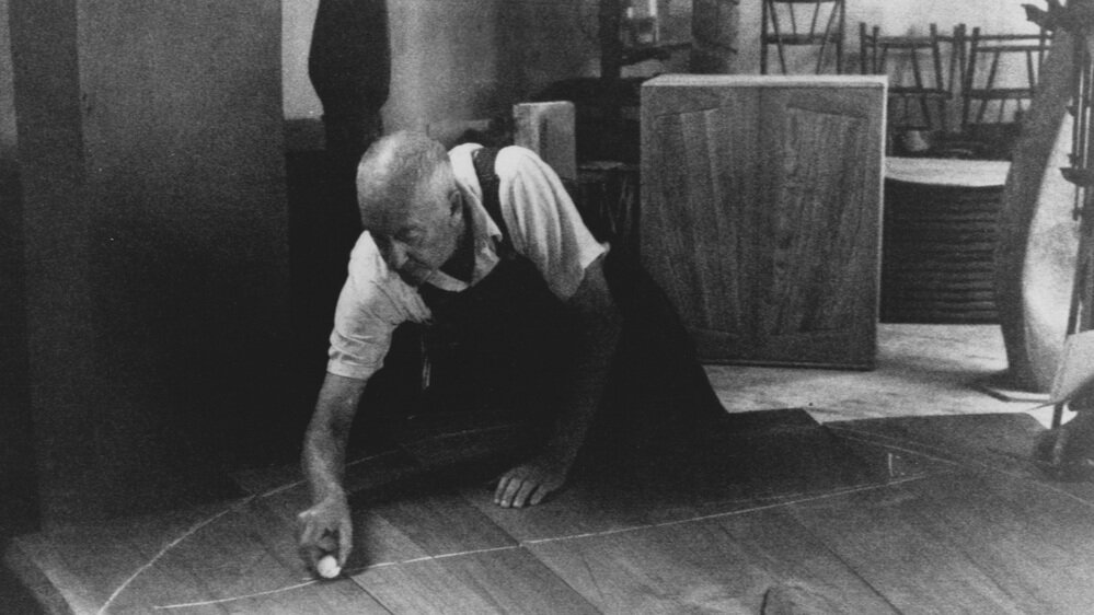
J.B. Blunk (1926–2002) was born in Ottawa, Kansas, and studied physics before switching to ceramics in college. Like Wharton Esherick, Blunk was an artist who didn’t make much of a distinction between home and studio. And like George Nakashima, he found much inspiration in the natural structure of wood—its knots, grain, colors, and textures. Blunk settled in the town of Inverness in the mid-1950s, and decided to build a cabin there himself. Now known as the Blunk House, the home was described in T Magazine as “a cottage from a midcentury-modern fairytale.” There’s a potter’s studio with three kilns, and a woodshop. Maria Nielson, Blunk’s daughter, and the author of a book on Blunk’s work, spends time at the house, where her father made everything from the sleeping loft to the ceramics in the kitchen by hand.

Woven into the fabric of the landscape and the house itself is redwood. The table in Blunk’s kitchen is crafted from a gigantic slab of redwood, and they dot the mountainous landscape of Inverness as far as the eye can see. Blunk was active in a variety of media, including clay and cast bronze, but his primary medium was wood. Sometimes a chainsaw was part of the picture. Blunk’s favored wood species was redwood, though he occasionally used cypress. Redwood’s characteristic color and natural softness gives it working properties that are almost clay-like. Blunk would salvage chunks of redwood on the landscape that had been discarded by loggers, and make use of his findings in the ways that best suited their scale. Using his chainsaw, he’d carve chairs out of single pieces of wood, sometimes creating “seating sculptures” that seemed to hover somewhere between sculpture and furniture. According to Mariah Nielson, even the bathroom sink in the Blunk House bears chisel marks.

 
Interior of JB Blunk’s home with artworks by Blunk, sofa by Max Frommeld, and cushions by Christine Nielson and Nancy Waite Harlow.  Photo credit: ©LeslieWilliamson

Interior of JB Blunk’s home with artworks by Blunk, sofa by Max Frommeld, and cushions by Christine Nielson and Nancy Waite Harlow.
Photo credit: ©LeslieWilliamson


From his time studying ceramics in Japan, Blunk was steeped in the aesthetic and philosophical principle of wabi sabi, which is difficult to translate precisely, but in an artistic context means accepting transience and imperfection, finding beauty in it, and not trying to “fix” anything about an object. Wabi sabi had a powerful influence on both historical Japanese crafts and on mingei, the Japanese craft revival movement that emerged there in response to industrialization in the 1930s, and was several decades underway when Blunk visited Tokyo.

A wabi sabi approach to craft could mean embracing asymmetry, or a nick or a scratch, or a perceived flaw in a piece of wood—like a discarded burl of no interest to commercial loggers. Blunk took the lesson of his craft training and applied it to working with reclaimed wood. Natural “flaws” became centerpieces, and odd shapes were just another form of inspiration. A major work entitled “The Planet,” completed in 1969, can be viewed at the Oakland Museum of California. It’s made from a single, the enormous root structure of a redwood—the only remains of a long-dead tree. It was typical of Blunk to salvage something that others had overlooked, and to create from it something unique, odd, and beautiful, that seemed at once ancient and modern. Perfection isn’t easy. But imperfection, at its best, is even harder to achieve. It seems safe to say that J.B. Blunk nailed it.

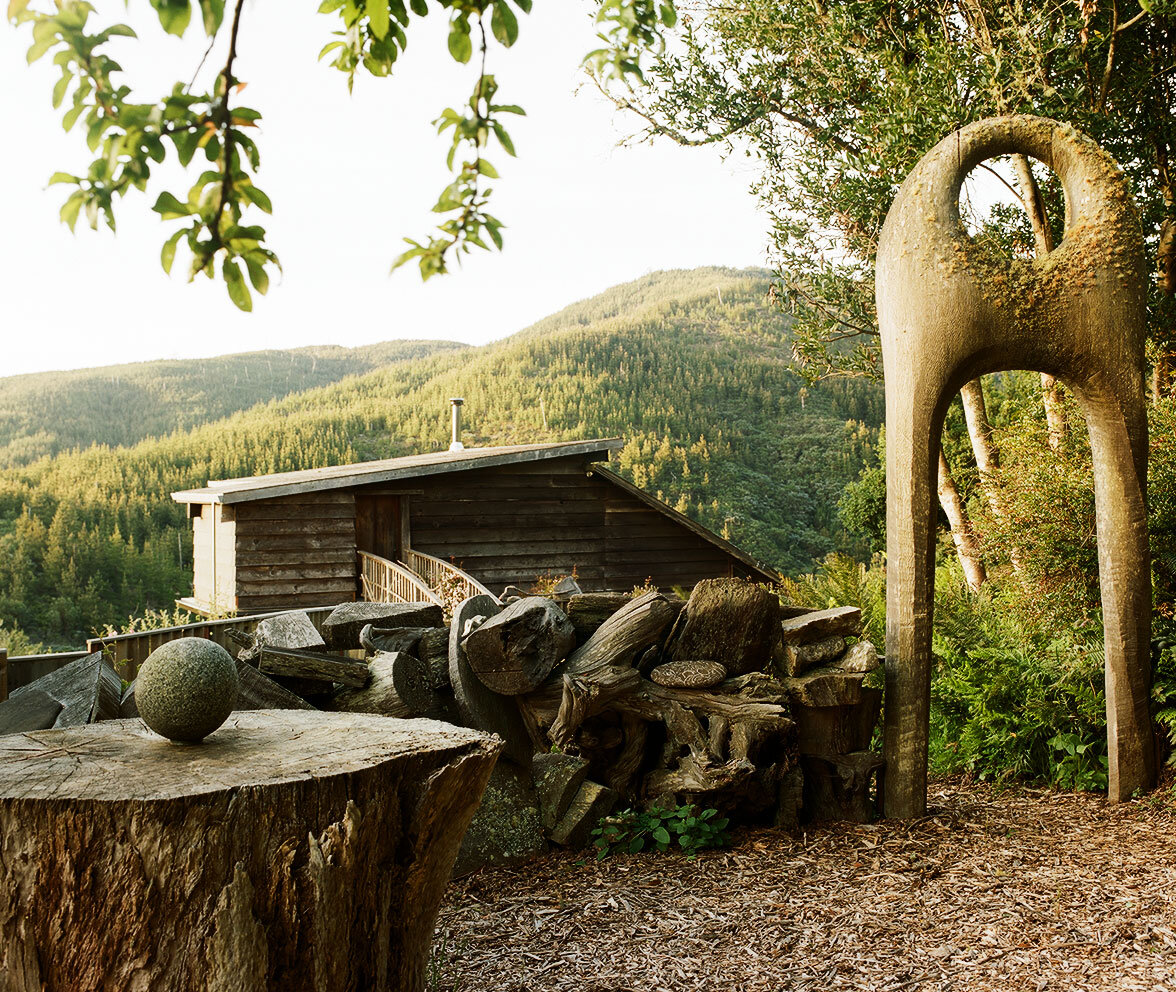
 
Wishbone, 1977. Sculpted Redwood, 110h x 54w x 35d in.  Image via Jason Jacques Gallery.

Wishbone, 1977. Sculpted Redwood, 110h x 54w x 35d in.
Image via Jason Jacques Gallery.


Reflecting on THE legacy of artistic problem-solver Wharton Esherick

 
WEoldchalkinglinesfortable.jpg
 

If you’re familiar with the work of Wharton Esherick (1887–1970), you’re probably imagining the most famous spiral staircase in Pennsylvania right now. Built in 1930 to replace a traditional staircase, it’s tightly curled and elegantly carved from red oak, with a rustic form that appears to defy gravity. Its thick treads seem to float as they spiral around a curvy central column. They’re actually mortised in place and supported by tenons, but the lack of any supporting structure (apart from a mastodon tusk handrail that was added in the late 1940s) gives the staircase an air of magic. It’s just one example from a long career in which Esherick seemed to ask himself what he could do with wood, and never backed away from a surprising answer. Unorthodox solutions and clever workarounds abound in his unique home and studio in Paoli, PA, which is now the site of the Wharton Esherick Museum. And that makes sense, because he never trained as a woodworker; first and foremost he was an artist, and he was able to fashion wonders from any material, never letting the strictures of carpentry fence him in.

 
The Spiral Staircase in Wharton Esherick's home and studio, 1930.  Photo credit: ©LeslieWilliamson from Handcrafted Modern, Rizzoli, 2010.

The Spiral Staircase in Wharton Esherick's home and studio, 1930.
Photo credit: ©LeslieWilliamson from Handcrafted Modern, Rizzoli, 2010.

Wharton Esherick in his studio with his sculpture Oblivion (dated 1934.) Photo credit: c. 1934 by Emil Luks. Image courtesy of the Wharton Esherick Museum.

Wharton Esherick in his studio with his sculpture Oblivion (dated
1934.) Photo credit: c. 1934 by Emil Luks. Image courtesy of the
Wharton Esherick Museum.


Famous for saying “If it isn’t fun, it isn’t worth doing,” Esherick crafted furniture, made sculpture, designed lighting and interior fittings, and even whole buildings. He’s considered an icon of the Studio Furniture Movement of the mid-20th century, and having lived and worked in Bucks County, he’s also linked to a group of important Pennsylvania makers of his era: George Nakashima, Phillip Lloyd Powell, and Paul Evans. He came from a well-to-do Philadelphia family, and studied printmaking and drawing at the Pennsylvania Museum School of Industrial Art (now known as the University of the Arts), then painting at PAFA, the Pennsylvania Academy of Fine Arts. He was discovering the world of painting just as American Impressionism was flourishing in Philadelphia and Bucks County. Esherick and his wife Letty settled in Paoli after finishing school and bought an historic farmhouse. Here he became interested in carpentry and the sculptural possibilities afforded by wood.

Esherick initially carved woodcuts—a natural outgrowth of his printmaking practice from art school—then he began making abstract sculptures from wood from in the 1920s. In 1926 his work was exhibited at the Whitney Museum of American Art. He then embarked on the long process of designing and building his own home and studio. And by the mid-1930’s, he was creating elaborate interior elements for local clients such as his famous doorway and fireplace for the Curtis Bok House. Considered some of his most important works, the dramatic doorway was meant to evoke the look of draping fabric, while the fireplace, which echoes Art Deco design but veers toward a more extreme, angular style, was inspired by the dramatic shadows cast by a roaring fire.

 
Fireplace and door by Wharton Esherick from the Curtis Bok House, 1935. Image courtesy of the Wharton Esherick Museum.

Fireplace and door by Wharton Esherick from the Curtis Bok House,
1935. Image courtesy of the Wharton Esherick Museum.

“A Pennsylvania Hill House” designed by architect George Howe for the "America at Home" display at the 1939 World's Fair. Photo by Richard Garrison. Image courtesy of the Wharton Esherick Museum.

“A Pennsylvania Hill House” designed by architect George Howe for
the "America at Home" display at the 1939 World's Fair. Photo by Richard Garrison. Image courtesy of the Wharton Esherick Museum.


Over the next several decades, his work was hard to pin down stylistically. Some works were crisp and geometric like the Bok House architectural elements. Others, like his own staircase and the biomorphic, abstract forms he sculpted, were soft and organic. In 1940, he created a suite of furniture for the exhibition “America at Home” for the 1939-1940 New York World’s Fair. Sixteen architects were invited to design rooms for the exhibition showcasing new American designs, and architect George Howe, who designed Philadelphia’s PSFS building on Market Street, invited Esherick to take part. Howe’s room was called “A Pennsylvania Hill House,” and its design captured the mix of modern and rustic style that was emerging in places like Bucks County in the middle decades of the 20th century. Esherick’s contributions to the exhibition included a sofa from the Bok house, the famous spiral staircase, a five-sided hickory table, and cherrywood wall panels. This exhibition represented the first time that Esherick’s work was seen by a wide-ranging public. Lousie V. Sloane, who was in charge of publicity for the “America at Home” display, wrote in a letter to Esherick that “The ‘Pennsylvania Hill House’ is a very popular room with visitors… and the stairway continues to bring forth exclamations, questions and comments from those who go through the building.” 

By his later years, Wharton Esherick was known among colleagues and admirers as the “Dean of American Craftsmen.” His work would eventually earn him a retrospective at the Museum of Contemporary Crafts (now the Museum of Arts and Design) in 1958, and a Gold Medal from the New York Architectural League. His work is included in the collections of the Renwick Gallery of the Smithsonian Institution in Washington, D.C., Metropolitan Museum of Art, The Whitney Museum of American Art, the Philadelphia Museum of Art, the Museum of Fine Arts Boston. One legacy of Esherick’s earliest years working with wood—and a renewable form of accessible art—are his printed holiday cards.

When he was first settling in Paoli and exploring his new surroundings, he made prints that captured the seasons, and his snow-covered scenes of houses and hills were very popular when he made them (and they still are today.) One such print, called “January,” appeared in The Century Magazine, and other prints of his were published in Vanity Fair and The New Republic. “January” depicts a person walking up a road blanketed with snow, with a single blackbird perched on a nearby fence, and four more circling overhead. Using the end grain of a block of wood to create the image, he carved away much of the lower third of the print to leave a pillowy expanse of pristine snowfall. It has an air of mystery, with frost disguising the landscape underneath, and the figure faces away from us. Looking at this image now, it seems quite modern for 1923. And in 2020, there’s something uncannily familiar about it. This holiday season, marked in so many ways by the COVID pandemic, means that many of us have carved out small groups to celebrate with, and some of us will celebrate solo. It feels strange, and it’s not easy. Esherick’s print is not overtly “Christmas-y,” and contains no text, but its single figure with his neighborly birds sends us a timely and powerful message. The only thing to do, especially in the cold and unknown, is to walk straight ahead.
 
“January”, 1923, wood engraving by Wharton Esherick. Image courtesy of the Wharton Esherick Museum.

“January”, 1923, wood engraving by Wharton Esherick. Image courtesy
of the Wharton Esherick Museum.


A Thousand Skills: George Nakashima

 
Nakashima%2BPhoto.jpg
 

You’ve probably seen George Nakashima’s furniture in the pages of shelter magazines, at auction, and in museum and gallery exhibitions across the country. His aesthetic influence is everywhere: your favorite cafe might have an eye-catching espresso bar with a live edge, or you might see a midcentury-style bench you like at a mass-market furniture retailer that ‘echoes’ one of Nakashima’s designs, to put it diplomatically. Or you might have heard his name and seen photographs of him with his family in an episode of the series Artbound on KCET, “Masters of Modern Design: The Art of the Japanese American Experience,” which tells the story of some of the renowned artists and designers who spent time in internment camps during World War II. Writing in Curbed in 2017, the architecture critic Alexandra Lange examined the connection between American design history and Executive Order 9066, which President Franklin D. Roosevelt signed in 1942. The order granted authority to the military to transport citizens to “relocation centers” in Arkansas, Arizona, California, Colorado, Idaho, Utah, and Wyoming. We call them internment camps today, and about 119,000 people—most of them Japanese immigrants or Japanese-Americans—were sent to live there for several years during World War II. George Nakashima was among them, as were the artists Ruth Asawa and Isamu Noguchi.

 
george-conoid-chair.jpg
george-mira-chair.jpg
 

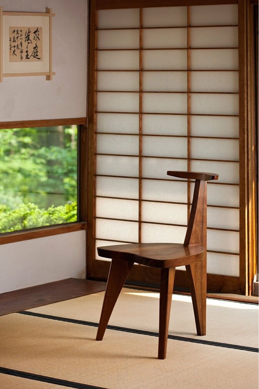
Nakashima was already a citizen of the world prior to the war, having spent a year traveling abroad on a round-the-world steamship ticket after graduate school. Born in 1905 in Spokane, Washington to Japanese emigré parents, he grew up hiking and camping in the forests of the Pacific Northwest with the Boy Scouts. He studied forestry at the University of Washington-Seattle, but was drawn to design as well, and graduated with a BA in architecture in 1929. He earned an MA in architecture from M.I.T. in 1931, and embarked on his world tour, spending a bohemian year in France, then traveling to North Africa, and finally to Japan. Nakashima met and eventually worked for the American architect Antonin Raymond, an associate of Frank Lloyd Wright, and he toured Japan studying building techniques and design. In the late 1930s, he was the project architect on the Golconde Dormitory at the Sri Aurobindo Ashram in Pondicherry, India, where he discovered two practices that would shape his life: yoga and furniture-making.

 
FamilyPortrait_possibly-new-land-March-1947.jpg
 
photo-8_george-and-mira-nakashima.jpg
mearto-nakashima-819x1024.jpg
Mira-with-George-childhood-1.jpg
 

He returned to Japan in 1940, where he met the woman who would become his wife, Marion Okajima, and the two settled in Seattle after marrying in Los Angeles. But in 1942, now with a new daughter named Mira, the Nakashimas were sent to Camp Minidoka, an internment camp in Hunt, Idaho. Incredibly, he used the time there to apprentice himself to a woodworker named Gentauro Hikogawa who had been trained in Japan. Hikogawa taught Nakashima to work expertly with Japanese hand tools and helped him master Japanese joinery techniques. He used whatever wood scraps he could find to practice his craft and develop his first designs for furniture. In 1943, his old mentor Antonin Raymond sponsored the Nakashimas for early release, and offered them his chicken farm in rural New Hope, PA as a place to stay. Mira Nakashima recalls that her father believed the name of the small town—which was becoming a mecca for woodworkers at the time—augured well for a fresh start. Nakashima quickly made connections with Knoll, for whom he designed several furniture lines such as the Straight Back Chair, and he designed a sofa for Widdicomb-Mueller which has gone back into production.


But most of Nakashima’s works were unique. He was famous for using butterfly joints, which allowed him to select unusual, asymmetrical pieces of wood and transform them into inviting dining tables and coffee tables. Nakashima had numerous lifelong clients, and he often signed their names in ink on boards that he selected especially for them. The largest private collection of Nakashima furniture was, for a time, that of Nelson and Happy Rockefeller, who owned over 200 works that Nakashima had designed for their Pocantico Hills estate. His passion for architecture, like his passion for forestry and trees, never wavered, and he was able to weave all three activities together at his home and studio. He designed buildings on his property, and was especially enamored of parabolic shapes, which led to the creation of a line of chairs called “Conoid,” with gently curved backs, which were named for the dramatic roofline of a building he called the Conoid Studio. In a sense, Nakashima didn’t believe in flaws. In his 1981 book The Soul of a Tree, which offered a glimpse at his philosophy and his technique and life story, he wrote: “Each flitch, each board, each plank can have only one ideal use. The woodworker, applying a thousand skills, must find that ideal use and then shape the wood to realize its true potential.”

 
Nakashima’s Conoid Studio in New Hope, PA. Courtesy of George Nakashima Woodworkers.

Nakashima’s Conoid Studio in New Hope, PA. Courtesy of George Nakashima Woodworkers.


The George Nakashima House, Studio and Workshop is now a United States National Historic Landmark and a World Monument, and although it’s temporarily closed as of July, 2020 due to the pandemic, the site is generally open to visitors. Today, Nakashima’s daughter Mira, who is an accomplished designer herself, works alongside a team of highly skilled woodworkers to produce both classic and new designs. A grant from the Getty Foundation has helped in the preservation and conservation of the site and its many unusual structures. There’s a museum and gallery in the city of Takamatsu, Japan where Nakashima once had a studio. In 1983, the man who once jokingly referred to himself as a “Japanese Quaker” was presented with the Order of the Sacred Treasure by the Emperor of Japan and the Japanese government. A key figure in American Modernism who spent most of his life in Bucks County, PA, Nakashima deftly combined the woodworking and design traditions of the United States and Japan. Despite his harrowing wartime experience as a Japanese American during the conflict that pitted the two countries against one another, he seemed to remain deeply rooted, aesthetically and philosophically, in both worlds.

 
C9J0228121008-1920x1280.jpg
 
Finishing-Rm-3-1920x1280.jpg
 

Inside Man: Contemplating Art and the Interior World with Donald Judd

 
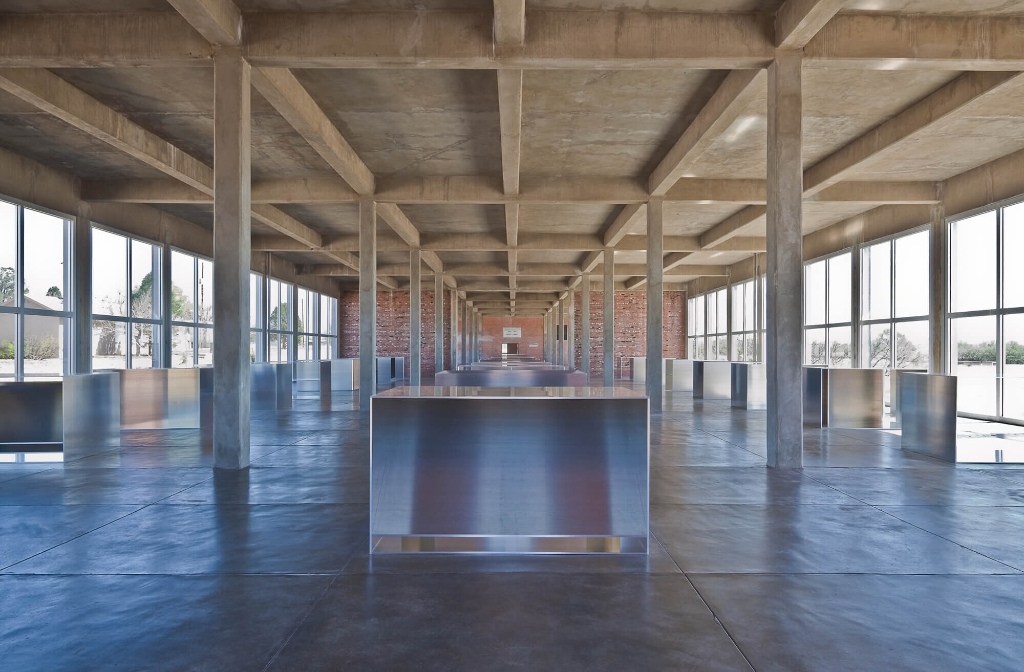
Donald Judd, 100 untitled works in mill aluminum, 1982-1986, Mill aluminum, 100 units each 41 x 51 x 72 inches.

Donald Judd, 100 untitled works in mill aluminum, 1982-1986, Mill aluminum, 100 units each 41 x 51 x 72 inches.


The artistic legacy of sculptor Donald Judd (1928–1994) is getting a lot of attention this spring: there is a major retrospective at the Museum of Modern Art curated by Ann Temkin, and a massive plywood installation at Gagosian Gallery, on view for the first time since 1981. This flurry of activity has fallen, quite by chance, at an odd moment: you can’t see either exhibition in person, because—as of this writing—institutions across the United States (and especially in New York City) are closed to the public in an effort to stop the spread of COVID-19. There’s also a book, and this you can read anywhere: Donald Judd Spaces, edited by Flavin Judd, Rainer Judd and the Judd Foundation, which offers newly published photographs from Judd’s archive, as well as five essays by Judd himself.

Judd is typically classified as a sculptor, but he didn’t like that term, nor did he like “minimalism.” He described his efforts as “another activity of some kind.” He began his career as a painter, and in the late 1950s and early ‘60’s, he worked as an art critic. This role gave him access to the postwar New York art world, where at the time Abstract Expressionism reigned supreme. As a blue chip artist today, Judd’s work is immediately recognizable: geometric, orderly, colorful, architectural, and smooth. Judd wasn’t precious about craftsmanship: once he began making three-dimensional objects, he started working with industrial fabricators, especially a commercial sheet-metal shop called Bernstein Brothers, providing them with detailed drawings and plans. In 1968, he bought a cast iron building on Spring Street in SoHo, and renovated it floor by floor, using it as his art studio and residence.


Judd in the early 1960’s in his studio on East 19th Street in New York City.

“Untitled” (1991) is among the many untitled works in ”Judd” at the Museum of Modern Art. The exhibition opens on March 1.Credit...Donald Judd Art; Judd Foundation/Artists Rights Society (ARS), New York; Zack DeZon for The New York Times.


In 1971, he rented a small house in Marfa, Texas, eventually assembling the compound around the Ayala de Chinati Ranch and the abandoned buildings of U.S. Army Fort D. A. Russell, which would in 1979 become the Chinati Foundation, with support from the Dia Art Foundation. In addition to the collection of important large-scale works by Judd and contemporaries like Claes Oldenburg, Dan Flavin and John Chamberlain, the Chinati Foundation preserves Judd’s living quarters and studio exactly as he specified. The Judd foundation does the same in New York where his Spring Street loft building is carefully preserved as a working and living space.

Writing of the MoMA retrospective in the New York Times in February of this year, critic Holland Cotter described Judd’s early forays into 3D work thus: “It was three-dimensional, so it wasn’t painting but, he claimed, it wasn’t sculpture either. He called the new works “specific objects,” and left it at that. He titled all of these objects “Untitled,” and insisted they were devoid of metaphors, personal data or real-world references — all the lures, in other words, that art traditionally uses to draw us in.” It may have been devoid of “lures,” but it wasn’t devoid of references: Judd’s specific objects, and the dwellings and studio spaces he designed them in, were the very “personal data” and “real-world references” Cotter believed Judd eschewed. Judd was a creature of the interior.


An installation view showing, in the foreground, “Untitled” (1963/1975); one of Judd’s earliest experimental objects (from 1961), left, with a baking pan sunk in its surface; and, right, a 1963 piece that shows him playing with space. Credit: Donald Judd Art; Judd Foundation/Artists Rights Society (ARS), New York; Zack DeZon for The New York Times.

Some of Judd’s objects come with special effects: Peer into either end of a row of the four aluminum boxes that make up this 1969 work and you’ll find that they form a long blue corridor with a reflective surface. Credit: Donald Judd Art; Judd Foundation/Artists Rights Society (ARS), New York; Zack DeZon for The New York Times.


Donald Judd - Daybed, 1979, Pine wood (with canvas mattress). 112 x 115 x 203 cm.

This is one of the key themes of Donald Judd Spaces, which brings readers into Judd’s material world. He placed objects and furniture in specific locations, and while he lived in New York and in Texas, he created works of art that themselves framed out space, with colors, forms, surfaces, and gaps. The Judd Foundation restored his residences and studios, so when visitors see them, they’re seeing something like a 20th century historic house museum rather than a collection of sculpture. The differences between his studio work and his forays into architectural preservation are mainly questions of scale: where he made room-size installations in his works of art, he also restored a SoHo building and conserved old structures on what is now the site of the Chinati Foundation, which could be read as gigantic Judd-type sculptures astride the landscape.

Right now during this indeterminate period of quarantine, it’s possible to read about Judd’s work, see some of his outdoor sculpture if you happen to be in Münster, Germany, the campus of Northern Kentucky University, or Marfa, Texas. You can watch an interview with Judd on YouTube via the Museum of Modern Art’s website—all part of a movement that’s taken shape in the past few weeks known as #MuseumFromHome. In a way, Judd’s work is particularly compelling right now because we’re experiencing an abundance of shared two-dimensional experiences: working remotely, reading the news on a tablet, playing games, streaming Netflix, even gazing out the window. The picture plane is all around us, signs and symbols everywhere. But inside, where we may least expect it, complexity and an abundance of forms in space abound. Our furniture, personal belongings, papers, and kitchen implements can all be seen, if we choose, as an interior landscape to be explored rather than overlooked or taken for granted. That’s the ironic twist of Judd’s temporarily hidden exhibitions: just thinking about them rather than seeing them—and indeed of Judd’s own spaces in New York and Texas—can make us see our own interior worlds in a new way.


READ THE BOOK: DONALD JUDD SPACES

An unprecedented visual survey of the living and working spaces of the artist Donald Judd in New York and Texas.


The Art of Yun Hyong-keun: Where Nature and Abstraction Meet

 
Yun Hyong-keun at his atelier in Sinchon, 1974. Courtesy Estate of Yun Hyong-keun. Image Copyright: Yun Seong-ryeol.

Yun Hyong-keun at his atelier in Sinchon, 1974. Courtesy Estate of Yun Hyong-keun. Image Copyright: Yun Seong-ryeol.

Spend some time looking at a painting by artist Yun Hyong-keun (1928 – 2007), and you might imagine that you’re looking at a group of trees. Dark, vertical forms stand at either side of the canvas. Seen one way, they appear to be massive tree trunks on either side of an open clearing. Or seen another way, they could be the dark edges of a wooded area at night, and in between them, the beam of a flashlight splits the darkness. Yun Hyong-keun is a widely acclaimed abstract painter, but there is something unusually earthy about his works on paper and canvas. His compositions seem to echo the architecture of the natural world, not in a sweet or cloying way, but with a sense of nature’s great power. With the knowledge that he spent time as a dissident during the Korean war hiding in a forest, the sight of large, imposing trees is a complex thing to behold. Are they protectors? Do they portend danger? Yun Hyong-keun spent decades of his extraordinary career negotiating these forms two dimensionally, all the while exploring and expanding on traditional Korean painting and paper-making techniques.

Yun Hyong-Keun, Umber-Blue (1978). Oil on cotton. 80.6 cm x 100 cm. Courtesy Estate of Yun Hyong-keun. Image Copyright: Yun Seong-ryeol.

Yun Hyong-Keun, Umber-Blue (1978). Oil on cotton. 80.6 cm x 100 cm. Courtesy Estate of Yun Hyong-keun. Image Copyright: Yun Seong-ryeol.

In an essay for Ocula Magazine written on the occasion of Yun’s exhibition at Venice’s Palazzo Fortuny in 2019, critic Sherry Paik recounted the artist’s harrowing youth during the decades of World War II, the Japanese occupation of Korea, and the Korean War. According to the exhibition’s curator, Kim Inhye, he never set out to be a political artist, whose work referenced or mocked propaganda. But the circumstances of his life wouldn’t permit him to be a bystander. During his childhood in the 1930’s in Cheongju, Korea was occupied by Japan, and he was 17 when the end of World War II terminated the occupation in 1945. Yun went to study painting at Seoul National University, but he participated in protests against the U.S. Military Government in Korea, which had established the school, and he was expelled. Because of his activities, Yun was then placed under surveillance and enrolled in an anti-Communist program designed to re-educate suspected communists called the Bodo League. In 1950, when the Korean War began, many members (some of whom didn’t even realize they had been signed up) were executed. Yun escaped arrest and death by hiding in the woods.

Yun Hyong-keun, Burnt Umber & Ultramarine (1989). Oil on linen. 45.5 x 61 cm. Courtesy Estate of Yun Hyong-keun. Image Copyright: Yun Seong-ryeol.

Yun Hyong-keun, Burnt Umber & Ultramarine (1989). Oil on linen. 45.5 x 61 cm. Courtesy Estate of Yun Hyong-keun. Image Copyright: Yun Seong-ryeol.

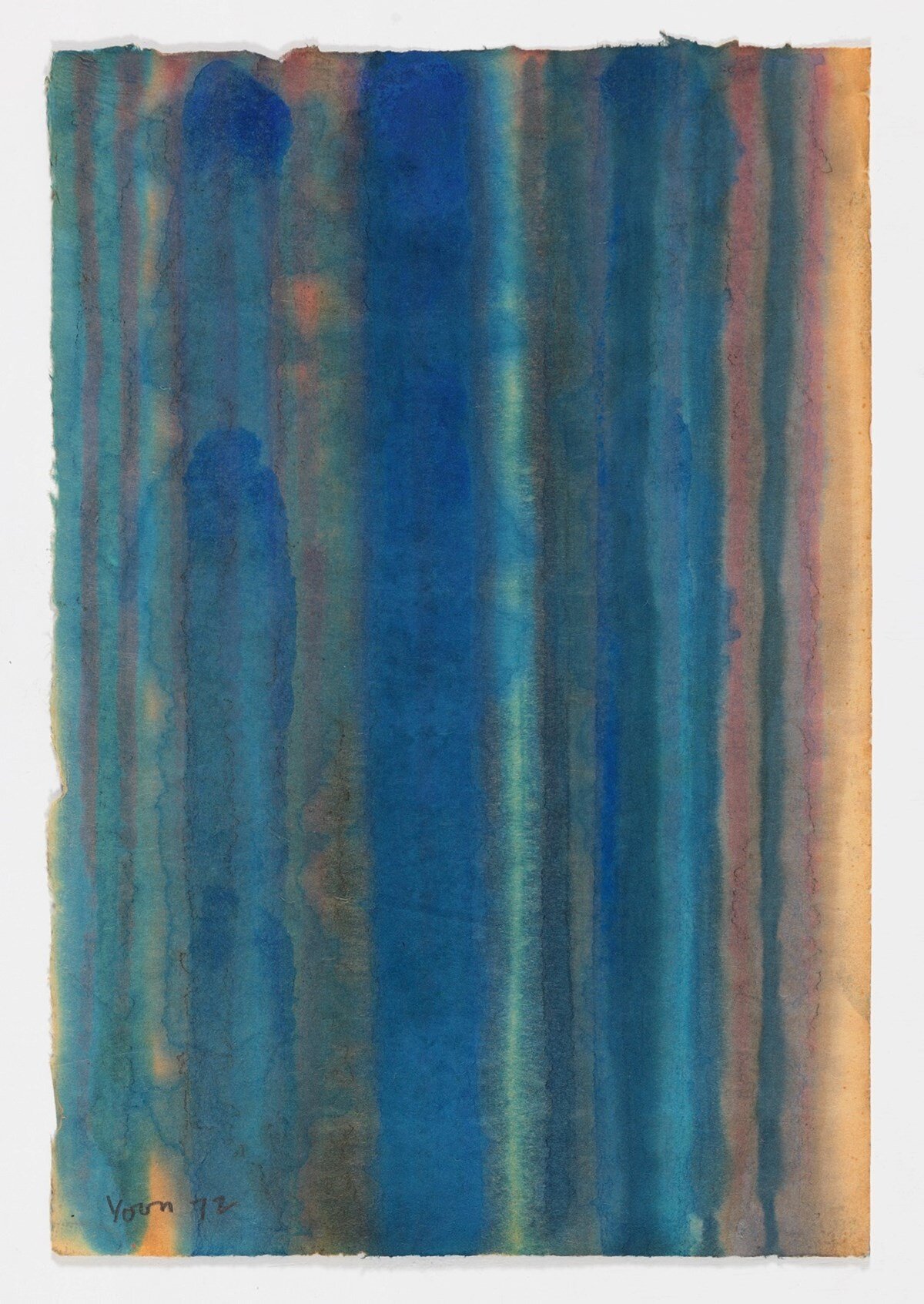
Remarkably, Yun never stopped thinking about art, or making it whenever he could. In the early 1950s, he met the artist Kim Whanki, who helped Yun enroll at Hongik University in Seoul where he continued painting. His work at this time was awash in color, and he used vivid hues to make abstract forms. He painted on hanji—a traditional Korean paper made from the bark of mulberry trees—on which color would bleed and give his abstract shapes soft, feathery edges. By the 1970s, Yun and Kim were both considered members of a movement in abstract Korean contemporary art called Dansaekhwa. Working during these decades in postwar Korea, artists like Yun and his contemporaries did not have access to abundant artists’ materials. They were creative, and used what they had at hand: Korean handmade paper (hanji), pencils and ink, even coal, burlap, and iron. According to Sherry Paik, the Dansaekhwa artists experimented with “ways of manipulating material, including soaking, pulling, pushing, dragging, or ripping paper.” 

Yun Hyong-keun, Untitled (1972). Oil on hanji (Korean mulberry paper). 49 x 33 cm. Courtesy Estate of Yun Hyong-keun. Image Copyright: Yun Seong-ryeol.

Yun Hyong-keun, Untitled (1972). Oil on hanji (Korean mulberry paper). 49 x 33 cm. Courtesy Estate of Yun Hyong-keun. Image Copyright: Yun Seong-ryeol.

Yun Hyong-keun: A Retrospective, 2019 Palazzo Fortuny, Venice, Italy. Photo credit: © Laziz Hamani / Courtesy: The Estate of Yun Hyong-keun.

Yun Hyong-keun: A Retrospective, 2019 Palazzo Fortuny, Venice, Italy. Photo credit: © Laziz Hamani / Courtesy: The Estate of Yun Hyong-keun.

Yun was never entirely at home in Korea for political reasons, but his work started to gain attention abroad in Japan in the mid-1970s. By this time he had begun using more creative materials, particularly burnt umber and ultramarine blue paint on raw linen or canvas.

He had an exhibition in 1976 at the Muramatsu Gallery in Tokyo, and collectors in Japan began to buy his work. In the early 1990s, American Artist Donald Judd visited Korea where he had an exhibition at the Inkong Gallery in Seoul. Judd was taken by Yun’s work, and invited him to visit America, and to show his work at the Chinati Foundation in Marfa, Texas in 1994. Yun was then selected by the government of Korea to represent the country at the 46th Venice Biennale—an achievement that would have been nearly impossible to imagine in Yun’s earlier life.

Yun passed away in 2007, aged 79. The exhibition of his work at the Palazzo Fortuny was a meaningful coda to his exhibition at the Venice Biennale several decades earlier. The space in which the exhibition was staged is a grand, imperfect, sometimes raw space, with a riot of textures and colors, surrounded by water. Yun’s work always reflected nature’s mystery. He used natural materials inventively throughout his life to realize his ideas, from mulberry bark paper and burnt umber to linen and charcoal. Seen against the backdrop of this idiosyncratic, historic setting—rather than workaday perfection of a typical white cube gallery—Yun’s paintings seemed right at home: works of art, perched on the line that divides abstract design from natural forms, made with the materials and tools at hand, mapping the edges of nature, as the water lapped against the building.

Yun Hyong-keun: A Retrospective, 2019, Palazzo Fortuny, Venice, Italy. Photo credit: © Laziz Hamani.

Yun Hyong-keun: A Retrospective, 2019, Palazzo Fortuny, Venice, Italy. Photo credit: © Laziz Hamani.


Inspired By: LAND

brand-specimens__land-rhodes-everitt__150520_191159_65210E84A986520E5CFCC7A097.jpg
brand-specimens__land-rhodes-everitt__150520_161157_770DDEE02B3FC53045F3FF9EBF.jpg
brand-specimens__land-rhodes-everitt__150520_161711_64A190A88BF342C0564F194FF5.jpg
Screen Shot 2017-11-17 at 11.57.40 AM.png
Screen Shot 2017-11-17 at 11.56.28 AM.png
LAND artists and designers Caleb Owen Everitt and Ryan Rhodes.

LAND artists and designers Caleb Owen Everitt and Ryan Rhodes.

LAND: Transcending Style and time

Austin, Texas based design studio LAND is a hard act to categorize.

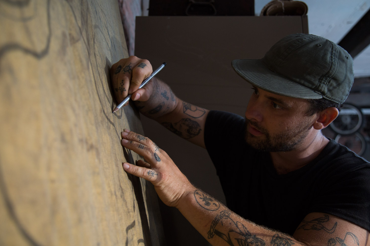
A team that clearly thrives on rethinking what it means to be a 'designer' in the 21st century, LAND creates a unique body of work in a wide variety of medias - from hand-drawn graphics, to linocut prints, to textiles and metalwork, brand campaigns for both digital and print, and, now, LAND even has their own line of limited-edition clothing.

In their own words, LAND is, "[A] house of art, design and thought: a collaboration between American artists and designers, Caleb Owen Everitt and Ryan Rhodes. Through an exploration of typography, iconography, and arrangement of materials, we demonstrate a way of working that transcends a style or time with regard to the art of communication."

Honesty through Imperfection

What inspires us most about this dynamic design duo is their collaborative process and their strong emphasis on how the imperfections of handmade art can bring an honesty and originality to modern graphic design and branding.

Caleb and Ryan have described art as the main source of their inspiration, with their 'sweet spot' being the process of blurring art with design to bring 'feeling' into each of their projects.  When asked about the difference between 'art' and 'design,' the LAND creatives have developed an answer that is both simple and profound, 'art is selfish, design is accommodating.' 

Reclaiming The Past, Always Moving Forward

In an interview with Urban Outfitters, LAND described their process of looking to the past for inspiration in their work: "Most of the type we create is hand done or inspired by historical typography. From old books and signs to hobo scribbles, type that was created by a hand or a machine just feels better than a more modern, digital font. It's more fun to create something custom, or that feels like it came from a real place before you and I were born and will be here after we're dead."

Past LAND Clients Include: Ace Hotel, Deus Ex Machina, Falcon Motorcycles, Levi's, Monster Children, Nike, Patagonia, Poler, Stag Provisions, West America, Woolrich. You can see a longer list here.

Special thanks to LAND for the use of their imagery. All art and design work is the (C) property of www.workbyland.com. Used here with permission.

279_121120_121056_patagonia.jpg
284_121120_040025_patagonia.jpg
static1.squarespace.jpg
tumblr_ng5o4fm0pp1u02s8lo1_500.jpg
brand-specimens__land-rhodes-everitt__150522_125426_3C6F00398CC89AC4C0074C8F32.jpg
At work in the LAND Studio. Photo by Chelsea Fullerton for Urban Outfitters.

At work in the LAND Studio. Photo by Chelsea Fullerton for Urban Outfitters.

At work in the LAND studio, Austin, Texas. Photo by Bill Sallans.

At work in the LAND studio, Austin, Texas. Photo by Bill Sallans.

At work in the LAND studio, Austin, Texas. Photo by Bill Sallans.

At work in the LAND studio, Austin, Texas. Photo by Bill Sallans.

Taking a break in the LAND studio, Austin, Texas. Photo by Bill Sallans.

Taking a break in the LAND studio, Austin, Texas. Photo by Bill Sallans.

Inspired By: Plethora Magazine

Plethora_Magazine_Issue_5_side_1.jpg
 
 
We wanted to highlight the natural beauty and tactility of print by using a format that allowed the craftsmanship to shine trough on an excessive level. Ultimately, we created this kind of otherworldly giant…an object that no one would know exactly what to do with.
'Anima Mundi:' the latest issues of large format (70cm by 50cm), bi-annual Plethora Magazine, created and published by  Peter Steffensen and Benjamin Wernery.

'Anima Mundi:' the latest issues of large format (70cm by 50cm), bi-annual Plethora Magazine, created and published by  Peter Steffensen and Benjamin Wernery.

8.jpg
35.jpg
_MG_5174.jpg

An otherworldly Giant

Plethora Magazine is an independent, biannual publication founded in Copenhagen which challenges the bounds of the conventional magazine format — conceptually as well as physically (each page has poster dimensions, 50cm x 70cm). 

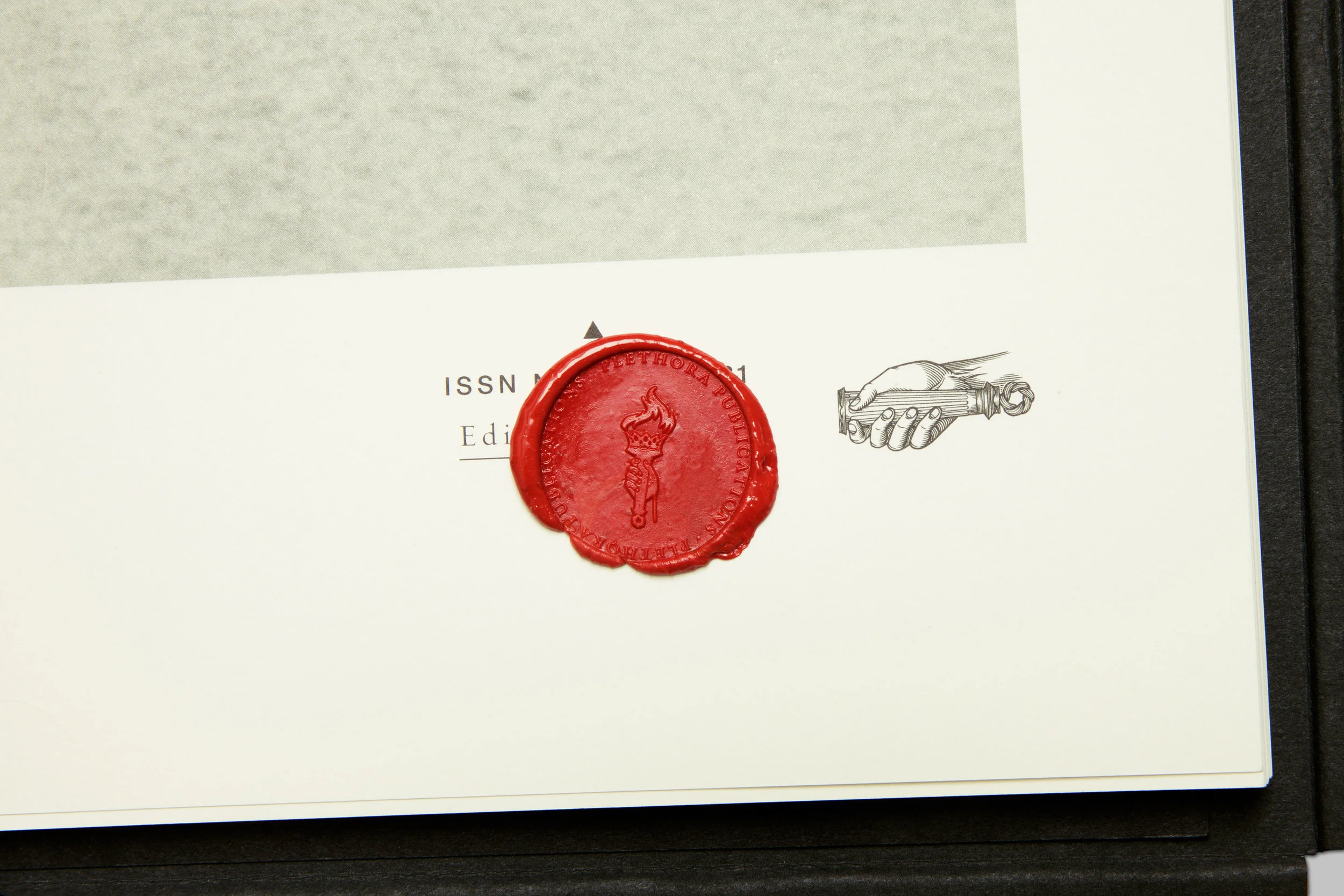
Skillfully printed by the monks of a Hindu temple, Plethora Magazine is unlike any other magazine on the planet: no noise, no ads and no logos, just 52 pages of poster-size visual indulgence and tales from the life less ordinary, presented in a careful blend of quirky archive material, wondrous art prints and contemporary artist features.

What inspires us most about Plethora, is how editor Peter Steffensen and art director Benjamin Wernery are curating such a fascinating variety of content - much of it reclaimed from historical ideas, technology, and imagery - to make something entirely new. 

Here are the highlights from our conversation with Peter Steffensen.

First off, tell us about the creative / professional journey that led you to Plethora?

I come from a background in philosophy and so, in  many ways, Plethora is a natural bridge for me between the academic world and the art scene. With Plethora, we are trying to shift the boundaries between the two fields and create a new context for both, essentially blurring the lines between fiction, myth, and science - which I think is an essential aspect of art. 

Was there one main idea that led to creating an oversized magazine now, in the digital age?

Yes, in fact. As you probably know, not that long ago, most magazines published a digital version to supplement their print publication. But now, that relationship has been been inverted. So, the aim for us was to turn all the inherent and presumed 'flaws of print' upside down and then amplify and refine them to a degree were they became attributes, specifically those qualities that are impossible to digitize.

Basically, we wanted to highlight the natural beauty and tactility of print by using a format that allowed the craftsmanship to shine trough on an excessive level. Ultimately, we created this kind of otherworldly giant…an object that no one would know exactly what to do with.

Why did you believe that bigger was better?

Well, we wanted to craft a very particular reading experience. The magazine's size naturally slows down the consumption of content.  Plethora Magazine is designed to actively involve the body so as to change the way we experience the content and then, hopefully, open up a space for reflection.

What we've observed is that the magazine's size does, in fact,  help people to both slow down and become quieter as they flip through and examine the pages - which is one of the hardest things for any of us to achieve these days.

Without giving away any trade secrets, what can you tell us about the printing process?

We are fortunate to work with very skillful printers here in Denmark called Narayana Ashrama Press, which is both a Hindu temple and a high end off-set printers. It’s truly a wonderful place and so, when we print, we actually move in and stay at their guest house during the whole process. This lends a much needed air on calm to an otherwise decision-intensive and hectic process. Don’t think we could make Plethora anywhere else.

what would you say is the 'red thread' that connects the themes of all six issues of Plethora to date? 

We work from a vast and ever-evolving archive of images and subject matter that we have compiled over the years (the crossroads between art and science is definitely a preferred territory for us). And these items make up the reservoir from which we can shape and slowly built a theme for each issue. Honestly,  the themes for some  editions can be years in the making. 

Ultimately, the trick is to create subtle intersections between a variety of narratives in order to bring about the element of wonder, which is essential to Plethora.  We want to create a experience where layers of meaning are endlessly unfolding, so there are new connections being made each time you open an issue. 

What's been the biggest challenge in bringing Plethora out into the world?

Almost from day one we’ve had to carve out our own niche within the world of magazine distribution. Also because it’s such a hybrid between a curated print collection, an object d’art, and a conventional magazine. So seeking out the appropriate platforms and outlets for the magazine has probably been the biggest challenge.

Do you have a favorite feature from the first six issue of Plethora?

Once in a while we manage to stumble on a real gem. And if I was to pick one out of the lot, it would probably have to be the feature on the Selknam tribe of Terra del Fuego (also called the Hain people), from our first issue (see below).

During the long preparation for issue one, we ran across these amazing black and white images of a now extinct tribal culture. They were all wearing these strange tribal masks and their bodies were totally painted and they were standing out in the snow. The whole scene was like something out of a strange and grotesque avant-garde theater productions. 

When we researched the Hain we discovered an incredible and elaborate mythology behind the initiation ritual - more complex than any greek tragedy. 

As it turned out the image we found were taken by a German priest and anthropologist who visited Patagonia in 1923 and who happened to witness and document,  the last ever initiation rite of the Selknam tribe. The entire tribe were murdered by settlers not long after the priest's visit.

So this story just had it all - fierce drama, mystery, forgotten meaning, archetypical signs and symbols - an ancient, universal narrative somehow. Working with this story really helped set the tone and standard for how we choose our features ever since.

What can you tell us about the impact Plethora is having around the world?

Only when an issue of Plethora is exhibited and unfolded in three dimensional space, can the potential of the magazine truly comes across, and the quality of the print can be best appreciated. 

So, from the very beginning we have prioritized traveling exhibitions abroad to show the diversity of our editions and to create experiences for a foreign audience that would have a real impact. And it gives us the opportunity to meet with our collectors in person, which I think is very important for our kind of product.

How would you say that ideas and artifacts, of the past inspire you to create and innovate?

I really appreciate the different traditional crafts that we encounter on our journeys. Especially in Asia, where the artisans have a very different approach to time and craft than we have here in Scandinavia. All in all, I like most esoteric things drenched in mystery and symbols. And much of the work we do on Plethora Magazine is actually one long semiotic journey to extract the meaning behind these.

So, for now, I definitely feel that I'm in the right line of work.

Learn more and shop at www.plethoramag.com

The Selknam tribe of Terra del Fuego from the first issue of Plethora Magazine.

The Selknam tribe of Terra del Fuego from the first issue of Plethora Magazine.

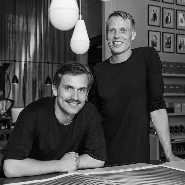
Peter Steffensen, Editor In Chief (pictured at right) and Art Director  Benjamin Wernery of Plethora Magazine.

Peter Steffensen, Editor In Chief (pictured at right) and Art Director  Benjamin Wernery of Plethora Magazine.

The aim for us was to turn all the inherent and presumed ‘flaws of print’ upside down and then amplify and refine them to a degree were they became attributes, specifically those qualities that are impossible to digitize.
— Editor-In-Chief, Peter Steffensen
Plethora_Magazine_Issue_6_SWARM_01-kopier.jpg
19.jpg

Inspired By: Selina van der Geest of NL-GB

SEVAN029 (1).jpg
SEVAN015 (1).jpg
The Reclaimed Brown Board Paneling we used on the outside of our house immediately adds a sense of history and character.
— Selina van der Geest
Selina van der Geest of NL-GB, photo by Venetia Dearden

Selina van der Geest of NL-GB, photo by Venetia Dearden

Introducing Selina van der Geest

Interior designer Selina van der Geest moved to New York from London in 2000. Since coming to America, Selina has worked in the art and decorating business and has now opened her own eclectic showroom near Millbrook, NY, 90 miles north of New York City.

After building her own house in Milan, New York, Selina was inundated with requests to add her unique style and organizational skills to projects for private clients. It has been a natural progression to continue the decorating business she started back in England, bringing a relaxed European feeling to her clients’ houses. She believes in working organically, reflecting in her designs and colors, the natural surroundings of the property she is transforming.

Earlier this year, we sat down with Selina to discuss her work.

Tell us a bit about how your time training in Europe prepared you for the work you do today?

Well, I studied history and art history which gave me a great background for my work in interior design.  I was lucky to combine both fields working for Colnaghi, the old master art gallery in London, designing stands and galleries as well as working with important art works. It was there that I learned woodworking and curtain making, thus giving me a very hands on approach to my work. The European aesthetic is different and has certainly continues to influence my work here in the States.

How did you choose Upstate, New York as the base for your home and business?  

My husband, who is Dutch, bought a house Upstate in 1983, when he first came to America.  I moved to New York from London in 2000 and since I share his love for the area, we purchased land in 2002 and decided to build a house. As soon as we finished the house, I was asked to help with other projects and so my work Upstate evolved.

what is the red thread that connects all of your design interests?

I am very inspired by nature and the environment around me, whether Upstate or on my travels. I often  incorporate natural elements into my designs.  Bottom line, I strive to create original homes and furniture for my clients and that's what drives me creatively.

What can you tell us about the design process for your own home in Milan, NY?

Before even buying the land, we bought an early 17th Century Louis XIII mantle in Bordeaux, France when we were there for a wedding.  Then, we designed the house around this and a pair of antique Chinese doors.  Coming from homes built of stone in England, I wanted to achieve the same sense of history and character in our new home Milan.

The Reclaimed Brown Board Paneling we used on the outside of our house, immediately adds a sense of history and character.  I stained the cut edge of all the batons, so we didn’t have fresh cuts showing.  It also has the advantage of requiring less maintenance.

Inside we have a large open room featuring Reclaimed Hudson Company Beams, which, along with the Bordeaux mantlepiece, give a very European character to the house.  On the floors we used wide white oak boards, which we left untreated so they could develop a patina over time.  The result is a home which feels very settled, relaxed and natural.

What were some of the key design goals for your new home?

We love cooking so wanted to have a big open space that would allow us to cook while also enjoying the fire and the living area.  You enter through a mudroom with the large Chinese doors creating a welcoming opening into the great room and a view through the French doors to the pool beyond. We often have our family and guests staying and having separate bedroom wings and a guest apartment help to give us all space, but a wonderful place to congregate.

We built the house in seven months and it was certainly an advantage to be on site daily. I spent many days shoveling snow or helping the framer when someone didn’t show up and nothing was delayed waiting for decisions.  I also insist on a clean and tidy job site, believing that a messy environment encourages sloppy work.

What's next for Selina van der Geest?

I am working on a new house being built in Sharon, CT for a client whose apartment I designed in the city. We’re combining a traditional stone farmhouse with painted barn buildings, a stone potting shed and an English green house. The goal is for the house to feel as if it’s been there for hundreds of years and has evolved over time.  Likewise, my goal is for the interior is to feel as if it’s been collected over the years, with interesting accents, textures and natural colors.

Lastly, how would you describe your experience working with The Hudson Company?

The Hudson Company have a wonderful selection of materials and a great aesthetic. From the sampling process to selection, they have listened and understood what we are after. Whether its a small order of individual planks and beams or a bigger order of  pre-finished wood floors, The Hudson Company has  always provided us with quality, professional services.

Visit NLGB.com to learn more about Selina's work.

Learn more about Reclaimed Hand Hewn Beams here and Reclaimed Brown Board Paneling here.

Below is a sampling of more interiors by Selina, with photos by Jane Beiles for The New York Times.

unnamed (8).jpg
unnamed (5).jpg
The Hudson Company have a wonderful selection of materials and a great aesthetic. From the sampling process to selection, they have listened and understood what we are after.
— selina van der geest
unnamed (3).jpg

The Hudson Company + Frama CPH

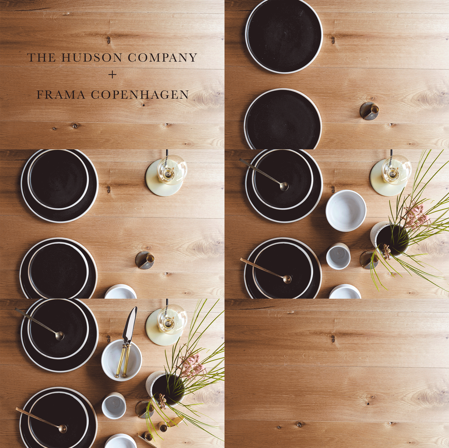
Custom mood board by Frama CPH for The Hudson Company.

Custom mood board by Frama CPH for The Hudson Company.

The Hudson Company + Frama

Scan almost any list of top design studios coming out of Scandinavia, and you will come across the name Frama - a Copenhagen-based design shop and creative team at the very forefront of Scandinavian chic. With their one-of-a-kind office space in Copenhagen's historic Nyboder neighborhood, Frama is a trendsetting brand that refuses to be boxed in by industry adjectives, which is appropriate, as the brand is constantly reinterpreting, rediscovering, and reimagining what it means to be a 21st century design leader (we think the photos below speak volumes about the quality and timeless elegance of Frama's work).

Here at The Hudson Company, we have been fans of Frama's inspired work for a long time, so, of course, we were thrilled this past summer, when they graciously agreed to create a custom mood board for us. Choosing from our full product range, Frama chose to focus in on our Select Harvest White Oak [Barley Finish] to use as the backdrop for their custom mood board.

Read on for some insights into what keeps the creativity flowing at Frama and how they brought this inviable mood board to life for The Hudson Company.

5 Questions with Frama

Tell us about the items included in your mood board, what's their origin story? Why did you select them for this mood board?

The objects of focus in our mood board design is our line of Aj Otto Stoneware - designed by Frama Studio here in Copenhagen. The ceramics are hand made in Denmark, which provides each product in the collection a unique feel. Although it has a Scandinavian aesthetic, the idea for this collection came from some old Italian glass food-containers discovered during some southern travels a few years ago.

Along with the Aj Otto stoneware, we've also included a variety of vintage and new brass pieces in our mood board. The cutlery is from different flee-markets, while the candleholders are designed by a young danish designer Maribel Carlander for Frama. Cut out of solid, untreated brass, these candle holders are a careful study in geometry, proportion and composition. Lastly, the E27 Table Light (also designed by Frama), is a simple, industrial and straight forward lamp which provides a cozy light to any table setting.        

Where does that team at Frama turn for inspiration, what sources are consistently inspiring?

Most often our best inspiration comes from dialogues with interesting people we meet on our travels, with whom we collaborate, or from people who stop by our studio.  

Overall, it's a central focus of ours to find the right balance between the traditional and the contemporary aesthetics, so we often look back in time for our inspiration whether that's to old art-posters or to historical building detail. Many of Frama’s design ideas grow out of the interior design projects we work on. We find that great inspiration can come from nature, art. architecture, as well from basic shapes and forms. 

Color and texture seems to be especially important to the items and collections that Frama produces: can you talk about that a little bit? 

Yeah, sure. Everything we do stems from an idea that we call "slow production." We use solid woods, untreated metals and stone to create both a aesthetically pleasing product, but also something that will “live” for a long time - these are long lasting and “honest” materials. Our design language is pretty straight forward, based in simple geometry and subtle, natural colors. These are the elements at the center of the Frama design universe. But we also love rich colors.

Choosing the right colors is essential for curating the final expression any space will have. So, with that in mind, we really thoughtful with how we use color - both in painted and non-painted finishes - so that everything is complementary. That's how we developed our St. Paul's Blue paint color with Jotun and it's how we got started with our upcoming line of colors based on the interiors of an historic Copenhagen space (coming in 2017).    

Is there a driving design vision or 'manifesto' that you use in your work and collaborations?

We often work within the area of re-interpreting design archetypes. Therefore, the objects of our collection often signals a return to basics. Our vision is always to come up with something new, but we try to maintain a historical feel to everything we do. The synergy between the past and present is important for our design process. Our main interests lay somewhere between two opposite poles - that space between classical and the contemporary design, that incorporates both digital and analogue production. 

Why did your team chose Select Harvest White Oak [Barley Finish] flooring as the background for your mood board? 

We chose this specific White Oak flooring because of its honesty. It has rich veins and you can clearly see and feel the knots in the wood. The color of the flooring is warm (natural white with a slightly golden hue) which provides a cozy feel to the mood board. Also, since it's Oak, you know that it is a solid, enduring surface. These are all qualities of material that reflect the Frama vision.

You can learn more about Hudson Company White Oak Center Cut, Barley Finish] here, and more about Frama here. 

Follow The Hudson Company on Instagram. Follow Frama on Instagram.

All photos courtesy of Frama CPH.

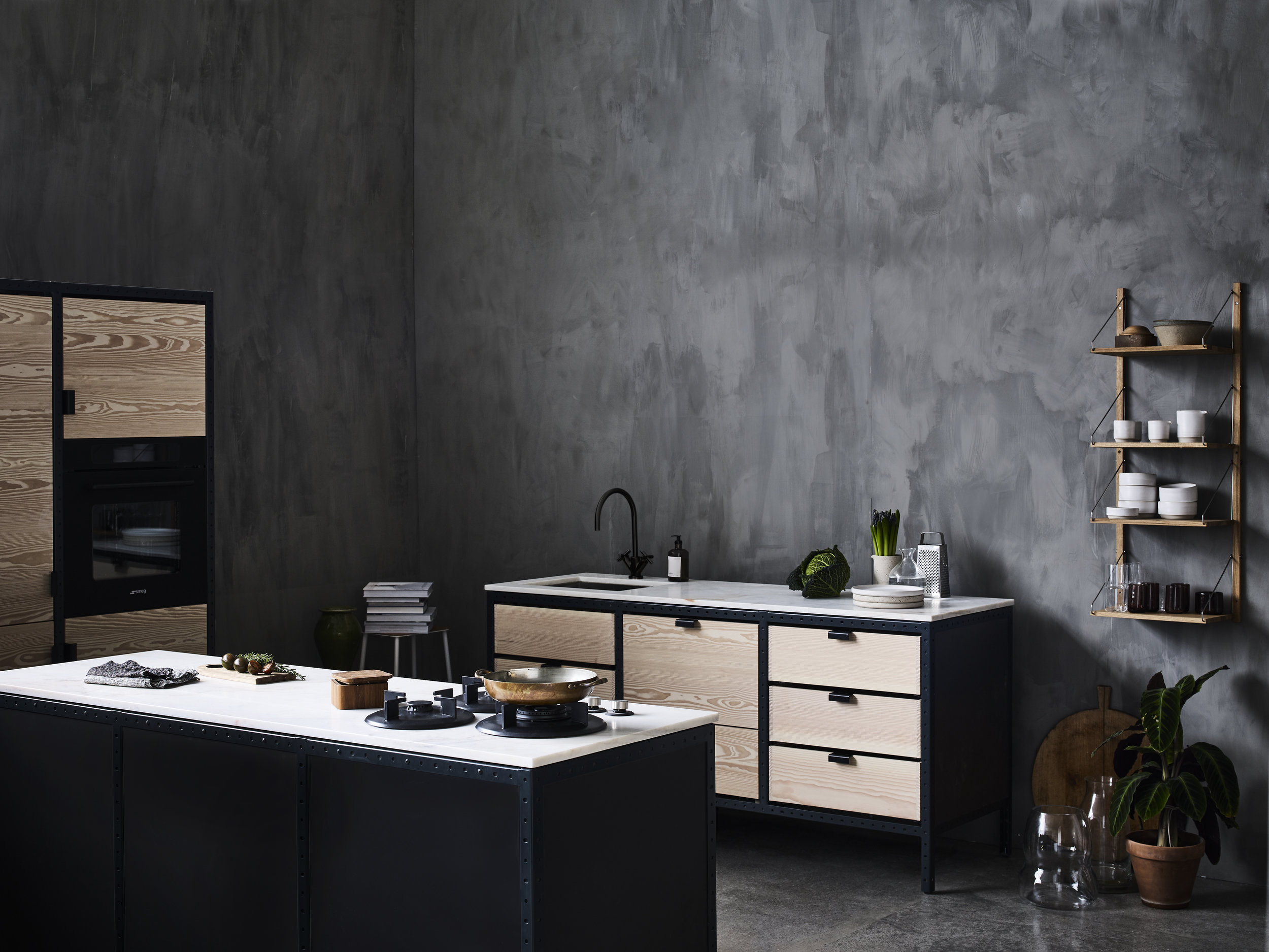
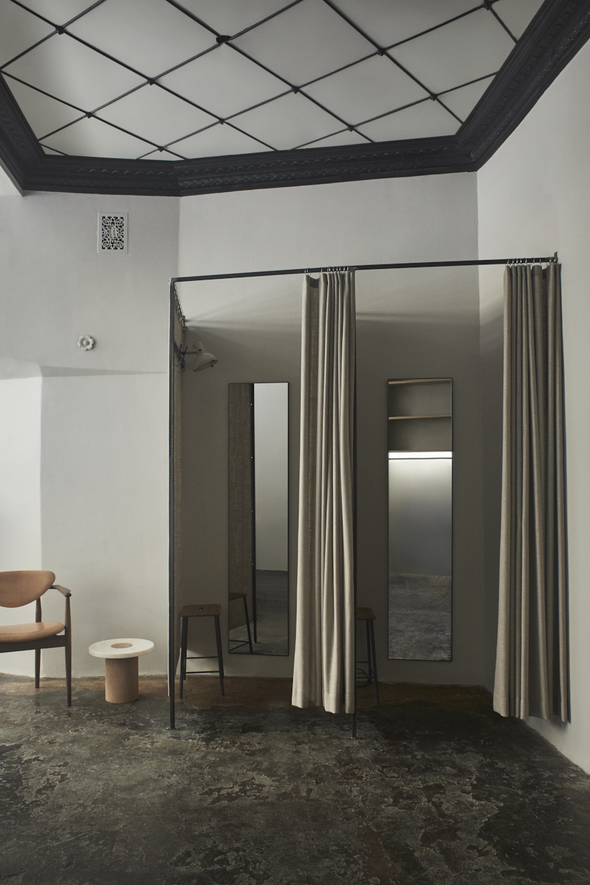
Frama Studio in Copenhagen, Denmark. All photos courtesy of Frama CPH.

Frama Studio in Copenhagen, Denmark. All photos courtesy of Frama CPH.

We often work within the area of re-interpreting design archetypes. Therefore, the objects of our collection often signals a return to basics. Our vision is always to come up with something new, but we try to maintain a historical feel to everything we do. The synergy between the past and present is important for our design process.
Frama's home offices and showroom at St. Paul's Apotek in Copenhagen.

Frama's home offices and showroom at St. Paul's Apotek in Copenhagen.

Hudson Company Select Harvest White Oak [Barley Finish].

Hudson Company Select Harvest White Oak [Barley Finish].

We chose this specific White Oak flooring because of its honesty. It has rich veins and you can clearly see and feel the knots in the wood. The color of the flooring is warm, and since it’s Oak, you know that it is a solid, enduring surface. These are all qualities of material that reflect the Frama vision.
Custom mood board by Frama Copenhagen. Wood background is Hudson Company Select Harvest White Oak [Barley Finish].

Custom mood board by Frama Copenhagen. Wood background is Hudson Company Select Harvest White Oak [Barley Finish].

Join us for FIELD + SUPPLY This Weekend

The Hudson Company + Field & Supply

The Hudson Company is proud to be a partner of the Field + Supply Modern Makers Craft Fair.

Field + Supply began in 2014, as a modern interpretation of a traditional arts and crafts fair.  It consists of a carefully curated selection of makers highlighting goods, old and new, from a variety of studios and workshops representing a wide range of crafts. 

This multi-day experience has grown to include delicious food and drinks from the area, along with hands-on activities as well as live music.  

This year, we've moved just around the bend to the newly refurbished Hashbrouck House in Stone Ridge, NY where we'll be able to accommodate even more makers and additional workshops. In addition, there are opportunities to enjoy cocktail parties, private dinners, a biscuit breakfast from the Hotel's new restaurant Butterfield's and a rousing celebration Saturday night to meet the makers! 

We hope you can join us over Columbus Day weekend, October 7th, 8th, and 9th at Hasbrouck House for a truly incredible gathering. Look forward to seeing you there!

*Note: All F+S guests should park at The Stone Ridge Orchard,  right around the corner from Hasbrouck House at 3012 NY-213, Stone Ridge, NY 12484. Shuttle service will be available to and from Hasbrouck House from the Orchard. There will be NO PARKING available at Hasbrouck House.

See a full list of Field + Supply exhibitors here and buy your single day or weekend tickets here.